Pollo Campero rebrands with a modern vibe; expects 20 restaurants to feature the new look in 2015.
 By Tim Pulido
Pollo Campero is the world’s largest Latin chicken restaurant brand, and while our roots run deep in Guatemala, we’ve grown to encompass more than 350 restaurants in over 10 countries worldwide. The first restaurant opened in 1971, and as we approached the idea of a rebrand, our challenge in 2014 was to stay true to the Pollo Campero spirit everyone loves.
As our leadership team and core experts strategized, we kept going back to one central question: What was the best way to keep delighting and surprising existing customers, while attracting new fans everywhere from the United States to Spain, Italy, Ecuador and Honduras?
Primary Challenges
Our existing design and setup were comfortable, but the restaurants were starting to feel worn and dated rather than retro. We needed something lively yet sleek that would draw the eye and feel current, but still hold fast to the essence of our brand.
The focus needed to retain an emphasis on our unique flavors, the same signature tastes that made us famous. But more than that, we had to find a way to open the door to a new generation of memories for both longtime audiences and first-time guests.
As we sketched out ideas and brainstormed, our biggest goal was to engineer a total restaurant experience that would help guests across the board come together over the table and enjoy a fantastic meal while experiencing our Latin culture.
To communicate an attitude as vibrant and passionate as our people, we worked on everything from the ground up, right down to minute details that would boost the curb appeal and stopping power of our restaurant. Hoping to draw in younger generations without turning off longtime customers, our assignment was to signal change without making fans feel like anything had been lost.
In February 2014, Pollo Camperos in Guatemala and El Salvador, the countries in which our brand started, implemented the rebranding and redesign. The fresh structures and formats proved successful, and we continued broadening the scope of our updated presentation and format.
Boosting Appeal, Inside and Out
The former curbside structure was white stucco topped with yellow awnings and a flashy red wall framing our beloved mascot, Pollito, whose welcoming wings spread wide over our name in a thick logotype.
The current curbside design is modern and angular. It features a warm wood portal, a green architectural fin to draw extra attention to the entrance, and tones of deep brown with bold green and orange accents. Pollito still welcomes guests into the restaurant; however, he now stands apart from our restaurant name, which has been renewed with a mix of youthful script and contemporary cap typefaces. The green canopy and awnings add energy and diversify to the color palette while a tan base brightens the overall exterior.
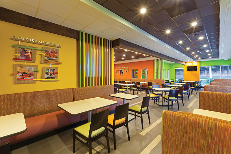 The interior redesign displays an authentic Latin vibe throughout, with coordinated color palettes that mirror the outdoor theme, wood flourishes to warm the space, streamlined design elements that avoid clutter, and thoughtfully branded imagery that tells our story.
Guests are welcomed with a wood wall featuring Pollito and a message framed in wood with yellow and orange accents to describe our proud history. When we opened the first U.S. Pollo Campero (of 56) in Los Angeles in 2002, lines of people wound all the way around the store. Our newly enhanced waiting area shows off a digital display that speaks to our rich heritage and commitment to doing things right — just as the Gutierrez family, our founders, always have.
As guests weave through the line, digital displays announce of-the-moment specials, offers and promotions. Neutral floor tiles run in a cool linear pattern that creates a sense of flow throughout the restaurant.
Seating upholstered in mixed colors and updated pendant lighting add energy and life to the dining room. Foregoing of our former cafeteria-style seating, we upgraded to a format with different sections of seating zones to provide a more private, individualized dining experience.
When larger groups come in, the flexible layout makes it easy to rearrange tables. Vertical slat dividers connect the design to the exterior and separate various dining areas, and televisions have been installed for entertainment.
A More Advanced Era of Operation
To maximize dining room space, which simultaneously minimizes waiting time, the redesign reduced kitchen space by about 200 square feet. Instead of just cutting space, though, we economized to make the area work smarter, not harder.
The kitchen redesign features more ergonomic, logical layouts to improve productivity and labor deployment. Prep stations have new organizational structures to increase consistency of side items and ensure a more dependable order that will impress first-time visitors and bring patrons right back to that first magical bite that kept them coming back for more.
Our kitchens were always visible to guests from behind the counter, but we wanted the appearance to be elevated and emphasize our made-to-order quality instead of looking industrial. Revised lighting and LED menu boards make the kitchen pop with a warm glow, and an additional wall behind the counter adds a fresh green palette to improve the overall counter experience.
On the ordering counters, we got rid of bulky stainless-and-glass refrigerators and dated point-of-sale systems. Updated flat screen point-of-sale systems take up less space, and we added more units to make ordering faster. At the center of the counter, three signature Latin beverages bubble in fountain containers with bright labels so customers can see the extra layers of Latin goodness firsthand as they order.
What’s next for Pollo Campero?
Our initial rebranded restaurants in Guatemala and El Salvador proved successful, leading to further updates at U.S. locations from the Washington D.C. metro area to Texas. Pollo Campero International has spearheaded the move to a global platform with a total of 10 restaurants featuring the updated image in the U.S. in 2014 — six remodels and four new restaurants, as well as three reimage stores that opened in Ecuador.
In 2015, three existing restaurants are scheduled to remodel completely, 10 more units plan to renew branding elements to reflect the new designs, and 11 new stores will open with the new image. We plan to have a total of more than 20 stores in the U.S. featuring our new brand direction this year.
Our redesign goes beyond brick and mortar stores. We are also in the process of updating our website, campero.com, and building an ordering app in the U.S. to offer easy online ordering to our customers.
Redesigns are costly and can pose a risk to any successful brand. The challenge is to captivate younger audiences while delighting existing customers. Pollo Campero invested serious time, energy and resources in developing our updated look and feel, but ultimately we found a way to upgrade to a more stylish look that connects our heritage with a contemporary feel and draws all audiences in for a taste of what makes us great.
— Tim Pulido is president and CEO of Pollo Campero International, the world’s largest Latin chicken brand.
[NOTE: This article originally appeared as the cover story of the February/March 2015 issue of Restaurant Facility Business magazine. Email the editor at [email protected].]