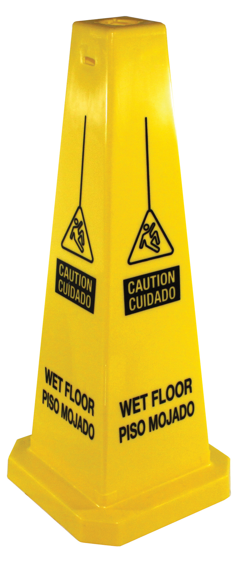
Such signs are beginning to place less emphasis on words or may not use words at all. What you need to know as a retail or restaurant facility manager.
By Dennis Knapp
Many of us are unaware of the fact that not all safety or warning signs indicate the same thing. By “safety or warning signs,” I am referring to those signs seen just about everywhere that say such things as “warning,” “danger,” “caution,” and so on. Further, as we shall discuss, the words used on those signs do not all mean the same thing either. For instance, a “warning” sign and a “danger” sign — even though they may appear to indicate the same hazard potential — are used for different scenarios.
And now with the adoption of the Globally Harmonized System of Classification and Labeling of Chemicals (GHS) as well as the adoption of ANSI standards,* these signs may start placing less emphasis on words or may not even contain any words at all — using pictograms instead. While all of this is meant to standardize signs to be recognized by a global population, it could make understanding the different meanings of safety or warning signs all the more difficult.
The first step in understanding safety signs is knowing that a color coding system is usually used to distinguish them. Color coding has long been used for identification purposes, and the one that pertains to safety and warning signs was developed primarily by the Occupational Safety and Health Administration (OSHA) and has been adopted in most of the world.
This color coding scheme includes the following key colors:
• Red = Danger: OSHA requires that signs indicating danger be in red or predominantly in red with contrasting lettering, usually in white; in most commercial facilities, we find the color red also used to indicate fire protection equipment and emergency turn-on or shutoff equipment used, for instance, by police or fire personnel.
 • Yellow and/or Orange = Caution/Warning: Signs indicating caution or warning are in yellow or predominantly in yellow with contrasting lettering, usually in white; warning signs specifically may be in orange with white or black lettering.
• Red and/or Orange = Biohazard: Red and orange are used once again, most often in medical facilities or laboratories, to indicate that infectious substances or waste may be present; along with contrasting lettering, they often will also have symbols known to indicate danger.
• Green = Safety Instructions: A green sign is often used to designate items that can be used after an accident has occurred, such as first aid equipment, eyewash stations, and so on. A green sign may also be used to indicate procedural instructions and reminders in a workplace setting. Labeling is typically in white or black.
• Blue = Notice: Blue signs are commonly used for communicating information to employees in a business or facility rather than to the general public; for instance, in airports, blue signs are often used to communicate information to gate agents or to provide instructions or information on regulations.
Understanding the Terminology
GHS, mentioned earlier, is going to have a significant impact on safety and warning signs . . . in time. Unlike chemicals, however, which are now required to carry the new labels, information and pictograms per GHS guidelines, there is no such requirement that old safety and warning signs be replaced with newer signs by a specific date. And because safety and warning signs can last many years, if properly maintained, this means that we can expect to see the same traditional signage and terms used to designate warnings and hazards for quite some time.
And even when new signs are selected following GHS guidelines, along with the required pictograms, they will likely continue to have traditional wording posted on these different signs. In light of this, it is very important that managers and workers have a good understanding of not only what the different colors of safety and warning signs mean but what the key terms printed on them mean as well. Let’s go through each of these key terms:
• Danger: The word “danger” is used to indicate an urgent situation and should be used only for extreme situations where there is a high probability of death or serious injury if someone is not careful. It should not be used to indicate the possibility of property damage; it should be used only in personal injury situations. As mentioned, these signs are in red.
• Warning: While caution and warning signs often overlap as to meaning, if the word “warning” is used alone on a safety sign, it indicates that there is a possibility, but not a high probability, of injury or death if precautions are not taken. Warning signs are usually in orange.
• Caution: The term “caution” on a yellow or orange safety sign indicates that a hazardous situation may be present that could lead to an accident or injury if precautions are not taken.
Safety and Warning Signs Usage
Now with a better understanding of what the different colors and terms found on a safety sign indicate, we need to discuss how to use and where to place such signs. Possibly the following very common example will help:
A custodial worker is mopping a hard surface walkway. While there are no specific standards or guidelines, safety and warning sign best practices tell us that the worker should do the following:
• The worker should use yellow signs labeled “warning” or “caution.”
• The first signs should be several feet — as much as 10 feet — in front of and behind the work area.
• Safety signs should also outline the work area; most likely a specific area has been left open to allow foot traffic to pass.
• As work continues, outlining signs should be expanded.
• When work is completed, all signs should remain for up to 30 minutes to ensure that the floor area has thoroughly dried.
• After 30 minutes, all signs should be removed; failure to remove signs when a hazard has been eliminated weakens their impact.
Similar strategies can be implemented, for instance, when a spill occurs on a floor or when a worker is changing lights or working above a walkway. The goal with this strategy is to give adequate warning that a potential hazard is upcoming, outline the area that foot traffic should avoid, and indicate where the hazard ends.
We should also point out that, when selecting safety or warning signs, it is usually best to select a fluorescent sign. These signs stand out, are highly visible, and are hard to miss.
Finally, safety signs should be kept clean and in good condition. View them as a reflection of both your retail or restaurant facility and your concern for the safety of your shoppers and patrons. A clean, well-maintained safety sign becomes an image of your facility.
* GHS was developed by the United Nations to help standardize warning labels so that a worker who, say, speaks only Chinese would be able to understand the warnings and precautions when using a chemical manufactured in North America with use instructions in English; ANSI is the American National Standards Institute.
— Dennis Knapp is director of product development at Impact Products, LLC. Impact Products makes a wide range of safety, floorcare, washroom and related products for the professional cleaning and building industries. He can be reached through his company website at www.impact-products.com.
