Tampa, Fla. — Burger 21®, an award-winning, “beyond the better burger” fast casual franchise, is celebrating the new year with a new restaurant design and refreshed logo design rolling out in all future and existing restaurants, to be completed in all corporate locations by the end of March.
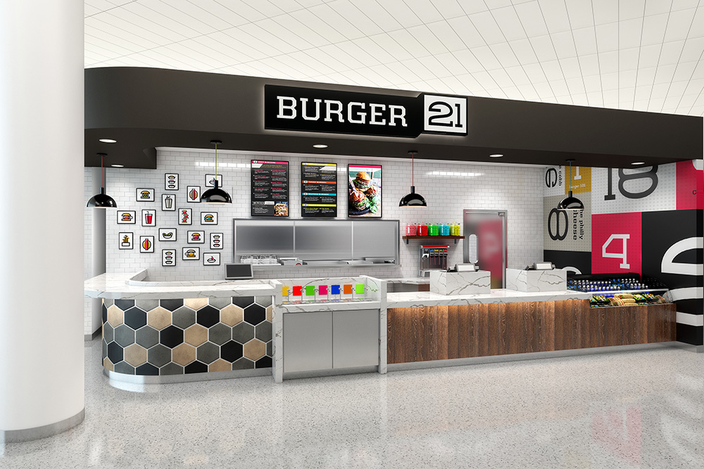
The new design was recently unveiled at the opening of the brand’s Sterling, Va., location (pictured above) and features a more modern look to match Burger 21’s innovative and creative menu. In addition to four footprint options now available to franchisees, the new interior design incorporates more natural materials and bright colors, accentuating the company’s multi-generational consumer appeal.
“Burger 21’s previous interior, while originally modern was more subdued, it was not speaking to our guests. We knew we wanted something that would emphasize our high-quality ingredients and the hand-crafted preparation of our food because those are the stars of the show,” says Arlene Johnston, co-founder and vice president of concept development.
 The Sterling restaurant reflects the new brand identity created by Terrain Collective, formerly known as Brand Architecture in Orlando, Fla. Sterling is one of four different models that are now available for Burger 21 franchisees to select. Options include the original 3,000-square-foot model as well as a smaller, 2,000-square-foot space, a hybrid version with a full bar and up to 4,000 square feet, and an 1,800-square-foot airport footprint (pictured at right).
Burger 21’s refreshed brand identity is also reflected in a new logo. Modern, straight lines convey an edgy cool look, while the black and white color reflects the classic timeless feel of a favorite burger place.
With 22 locations now open in Florida, Georgia, Illinois, Michigan, New Jersey, New York, North Carolina and Virginia, and approximately 15 in development in six states, Burger 21 is a “beyond the better burger” fast-casual franchise concept founded in 2010. Burger 21 is headquartered in Tampa, Fla.
SOURCE: Burger 21
