— Interview by Katie Lee —
How The Container Store’s new prototype design enhances the customer experience.
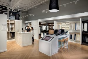
When The Container Store unveils a new store prototype, you can bet it is innovative, organized, high-tech, and a completely refreshing customer experience. On those points, the Dallas-based home organization retailer does not disappoint. Two years in the making and created by FRCH NELSON in partnership with digital agency MJD Interactive, The Container Store’s next generation store mirrors individual rooms in a home, allowing customers to visualize how each room in their home, too, could be organized. In July,

Brandon Avery, FRCH NELSON
Retail & Restaurant Facility Business interviewed Brandon Avery, creative managing director at FRCH NELSON, about the new look, which will eventually be rolled out systemwide. Founded in 1978, The Container Store currently has approximately 90 stores.
R&R: Let’s talk about The Container Store’s new prototype, which was unveiled last year at the company’s 24,500-square-foot flagship at One Lincoln Park in Dallas. What was the inspiration behind the design changes?
Brandon Avery: Our team wanted to evolve the brand experience and attract The Container Store’s next generation of customers, with the overarching goal to drive growth in key categories and increase trip frequency to The Container Store.
R&R: It’s been proven that the biggest hurdle to beginning an organization project is feeling… overwhelmed. How does the new generation Container Store address that?
 Avery: A new lounge area called ‘The Organization Studio’ was created. The digital service tool enables customers to upload a photo or video with a description of a challenging project and then invites them to set up an appointment with an instore expert. The Organization Studio offers the convenience of an online experience and marries it with a personalized in-store engagement that offers a curated solution created by a real person.
The key element of the experience is the collaboration of high-touch technology with a human connection.
R&R: Tell me more about FRCH NELSON. You have offices in Cincinnati, New York and Los Angeles and a team of over 200 experts; your integrated NELSON network includes nearly 1,100 team members in more than 25 locations. What do you bring to the table when it comes to retail design?
Avery: FRCH NELSON is a global brand experience firm delivering architecture, interior design, graphic design, branding services and consulting services for all facets of the retail and restaurant industry, from innovation to implementation. As the retail center of excellence within NELSON, we combine over 50 years of experience with cross-functional talent and geographic reach to turn ideas into actions.
 As retail continues to transform, FRCH NELSON is looking beyond the immediate industry, to environments and concepts inspiring the retail of tomorrow. Today’s consumers engage with brands in a fluid manner as the traditional sectors of retail, restaurant, hospitality and entertainment have blurred to embrace a new mosaic of consumer-desired experience, influenced heavily by engagement, access and authenticity. Embracing these new expectations presents brands with a greater opportunity to differentiate, cross-sell and expand the breadth of their offering.
R&R: Please describe the new average square footage of The Container Store and how operational efficiencies have been improved, as well as the customer’s in-store experience.
Avery: While the store size didn’t change, SKU reductions (right-sizing certain categories) allowed our team to reimagine the customer’s in-store experience and other merchandising strategies. With the additional space, we added the aforementioned Organization Studio, Custom Closet Studio and an expanded kitchen section.
R&R: Some customers thought the old store design — much like home projects themselves — was ‘overwhelming’ since there are so many niche products. How does the new design address this issue?
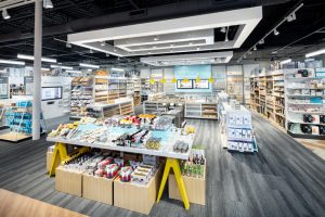
 Avery: The new design reduced product and opened up sightlines in key categories, allowing for a merchandising hierarchy that creates clarity. New fixtures provided focused storytelling moments for significant products, displayed in a way that enables customers to visualize how it might look in their homes. The new experience and space around the brand’s merchandise now feels more hospitable, consultative and inspiring.
R&R: Tell me about the ‘First Things First’ section of the store.
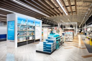
Avery: First Things First showcases The Container Store’s most innovative products that represent the fundamentals of organization. To prevent intimidating the customer, this concept helps people understand how to start small and take it one step at a time.

(Photo Credit: Mark Steele)
We filled it with smaller and seasonal items as a way to get the customer started on their organizational journey, so the store feels fresh and inviting each and every visit. From there, we created spaces for the parts of the home that people really get excited about: the kitchen and office. In the kitchen, we incorporated a large kitchen island that allows the brand to feature items like under-the-counter organizational tools in the same way that they would be used within the shopper’s home.
R&R: Let’s talk tech. How do the touchscreens in each ‘room’ of the new prototype work?
Avery: Our prototype leverages design and technology to establish a more personalized experience for shoppers. Each department features a digital look book to browse ideas, get inspiration and view products. The reimagined experience also offers a range of high-tech services; these include 18 digital touchscreens on which consumers receive tips and inspirational ideas, an optimized product navigation system, and The Organization Studio.
R&R: What were some of The Container Store’s operational related challenges that the new design is able to address?
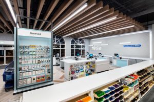
Avery: With the previous design, store employees were hidden behind tall fixtures and stocking shelves. The new design makes store associates more visible and accessible to guests who need assistance, making it a more positive experience overall.
R&R: What makes designing a Container Store unique compared to other retailers?
Avery: Just the amount of product. We wanted the experience to feel more intimate and less like an overwhelming big box store. We lowered ceiling heights, added new flooring and upgraded [LED] lighting in order to make the store seem more comfortable and inviting — more of a specialty store feel.
— This article originally appeared as the cover story of the August 2019 issue of Retail & Restaurant Facility Business magazine. Email the editor, Katie Lee, at [email protected].
