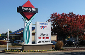
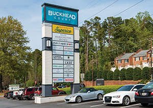
3 reasons to replace your shopping center entrance sign.
By David Goodwin
An outdoor monument or pylon sign creates a lasting image of your business to everyone who passes it. Just as a pristine, gleaming sign can be a powerful endorsement of your business, an old and run down example can serve as a negative critique on your property and your tenants.
Despite a sign’s importance, shopping center operators too often miss the aesthetic and financial signals that their signs have outlived their best days. Even a sign that’s 5 years old may need updates such as LED lighting or digital displays to bring it up to current standards.
Here are the three most important reasons your center’s sign may be working against you:
- It’s not making a great first impression
The most obvious and urgent cause for replacing your sign is evidence of aging: faded or outdated colors, as well as rusting or ineffective electrical components.
 Any evidence of damage or disregard will suggest to would-be customers that your products or services carry a similar level of unreliability. You may think the lights on your sign are working fine, for instance, but if they have dimmed and lack the vibrancy customers expect, it will dim their view of your business. In fact, almost two in five shoppers (a 4-year study average of 38.5%) say they’ve made quality assumptions about a business based on whether that company has clear and attractive signs, according to the Sign Research Foundation.
Similar to creating curb appeal when selling your home (fresh paint on the front door, new bulbs in the porch lights and neatly trimmed shrubs), your sign is an important part of your business’ curb appeal.
- It’s becoming invisible
Your sign may be in mint condition, but if it has been around for awhile it will appear dated to those who see it regularly. In fact, if customers have been seeing the same sign for 10, 15 or even 20 years, it may become almost invisible to them. Imagine seeing the same ad, in the same position, in the same daily newspaper for 10 or more years. Do you think you would even “see” it or pay attention to it after awhile? Your sign gets a ton of “impressions” but it also runs the risk of becoming invisible over time.
A sign that has been around for too long can also suggest that a business is stuck in place. Meanwhile, a rival down the street with new signs will seem more progressive and innovative. Shopping center operators are often surprised at how revelatory a new sign can seem. It has the effect of “waking up” the entrance to your center and making it seem new again.
- It’s not producing ancillary revenue
 Traditionally, monument and pylon signs have featured the name of the shopping center more prominently than the tenants that actually draw visitors. Some may only feature the name or logo of the anchor but not smaller tenants. Both scenarios are missed opportunities for generating ancillary revenue.
A new sign provides the opportunity to offer advertising to many, if not all, of your tenants. Consider adding a digital display to provide tenants the option to advertise special events and sales. This type of advertising is more valuable to brick-and-mortar retailers than other forms of promotion such as newspaper ads. The new revenue generated through your sign will not only pay for your sign’s construction in just a few years but will also become a nice profit center for the majority of the sign’s useful life.
Your monument or pylon sign is the workhorse of your center’s and your tenants’ marketing programs. Take a closer look at your sign today and try to see it as a customer would. Are you making a great first impression? Are you prominently featuring your tenants’ brands? Does it stand out and encourage visitors to choose your center?
— David Goodwin is president of Ad Vice Studios, a Richmond, Virginia-based marketing services and sign design company. Goodwin collaborates with property managers, developers and architects to transform commercial properties into attractive destinations. Learn more at www.advicestudios.com.
